
Environmental Visual Cue/Design Analysis
I was once asked during my time as a Master’s candidate: What is your prior experience with visual literacy and design? How do you define visual literacy? Have you considered this before? How might or does it play a role in your current setting?
Below are my responses to these questions.
Unfortunately, as an instructional designer in my previous life and given the nature of the training topic, there were few opportunities to use new visual design elements. A vast majority involved situational learning by using the latest devices and troubleshooting software. All classes were taught in classrooms through instructor-led training sessions with a strong emphasis on hands-on learning. Occasionally, there were PowerPoint decks that outlined the course objectives, providing an opportunity to use simple graphics to draw the learner's attention to the importance of the slide. From an instructional design perspective, my use of visual design for learning is quite limited.
I would define visual literacy as the skill set that enables the creation, analysis, interpretation, and evaluation of visual information. It incorporates the ability that allows individuals to to effectively understand, use, and communicate through visual media. I believe it is essential to acknowledge and understand the various elements that influence visual communication, including technological aspects, cultural influences, ethical considerations, and artistic principles.
In my current role, I occasionally build high-end gaming and productivity PCs for clients who want to focus on design and aesthetics. I also custom-built the desks and workspaces where the computers will be used. Here, visual design is crucial, as clients have varying expectations regarding how PCs and workspaces represent their personalities and aesthetic preferences. The process of getting to know the clients, seeing the spaces where the PC and furniture will be the centerpiece, and analyzing the elements of the environment all help me establish the type of design choices I will make during the construction of the build. The design of the PC and workspaces conveys information about the client’s personalities and priorities. Do they want a simple, $5,000 all-black, enclosed case PC where little design is required, or do they want a highly personalized, $12,000 PC that showcases the PC in the space?

Starbucks logo
I wanted to find a space where I can visit often that might have varied options to exemplify “visual literacy.” I chose to use Starbucks’ logo. In this instance, I do not believe it to be a good example of visual literacy as defined above. Out of all the images, I find that the company logo is confusing and is based on a number of assumptions. Starbucks got its name from Starbuck, a character in the novel Moby-Dick. The company's founders chose this name to connect with the maritime history of coffee trading and Seattle's seaport heritage. First, you must assume the customer has a familiarity with Moby Dick, and secondly, you would have to know that the company’s founders wanted to evoke emotion by appealing to Seattle’s history in the coffee trade. One would also need to have knowledge that a siren, while not in Moby Dick, does have a connection to seafaring in Greek mythology. Most importantly, one would have to recognize the logo as a siren in the first place. One would have to make many assumptive leaps to make the connection that this is a logo for a coffee company. The evolution of the logo shows that the earlier iterations of the Starbucks logo, which included the word “coffee,” conveyed much more information than the current version. It appears that the company felt that the logo had become culturally pervasive enough so that less information was needed.
While the logo is visually clear, colorblind friendly (it only uses one color on a white background), recognizable to a certain audience in certain locations, and pleasing to look at, the meaning behind it is not. I do not believe that the visual makes information easily accessible unless one understands the history of what Starbucks is famous for. While one of the more recognizable logos, it must be memorized to associate the establishment with its products. I believe that the company should, at bare minimum, revert to an earlier iteration of the logo where coffee is mentioned or have a new design that incorporates some minor description of the company’s core business.
While the logo is pervasive throughout the United States, someone from another part of the world would have no inkling that the logo was for an establishment known for selling coffee. While the logo is distinct and recognizable to some of the population, it does not represent the product or the company that sells it. “Starbuck’s” was named after the first mate in Moby Dick where a whale was the focus. The company's logo does not relate to this in any way. Unless you have memorized what the logo stands for, you learn nothing from it. It does not leverage picture superiority theory as outlined by Malamed (2015).
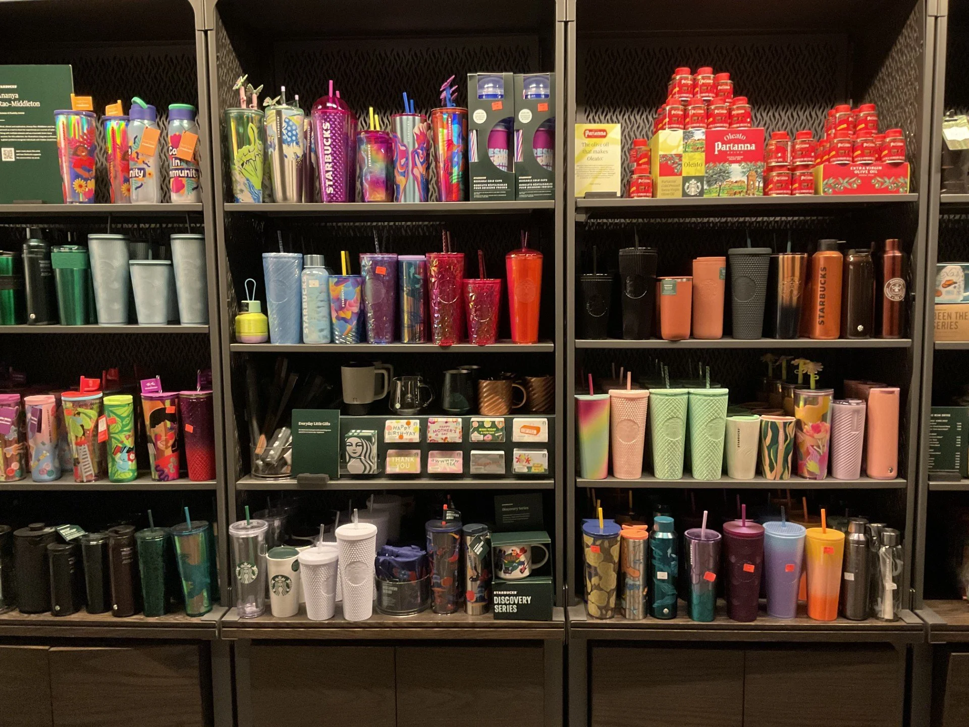
Wall of coffee mugs and carafes
I chose this picture because I think it conveys its meaning well: to display products for sale to those who want to drink something out of a container that makes a statement about some aspect of their taste and personal aesthetic. The pricing stickers are prominent, allowing the viewer to know that the products are for sale. It is worth noting that the price stickers are relatively small, perhaps to draw the customer closer to the products. The products appear to be grouped by color and/or pattern, allowing customers to find what appeals to them and their preferences quickly.
As a primarily liquid-based business, the display and its components effectively convey this within the company's context. All the cups and flasks are “faced” (they are all uniform with the product facing forward). This leads the viewer to pay attention to detail. This feeling could spill over into how the viewer perceives the rest of the business as being just as detailed. It has been my observation that while customers wait for their order to be ready, they instinctively find themselves looking at the mugs and cups. I believe this is due to the proximity of the display to where customers pick up their orders and the attractiveness of the display. Grouping products by color and pattern helps make the display more appealing and makes it easier for a potential buyer to find something to their liking.

Impressionistic painting of Starbucks’ logo
Finally, I selected this picture of a stylized painting of the Starbucks’ logo. As Malamed (2015) points out, design and fine art diverge in several key aspects: their objectives, initial inspirations, available resources, required skill sets, and criteria for success. Each field has its own unique characteristics that set it apart from the other. In this instance, I believe it to lean more toward design than art (though either/and both could be the case). I believe an artist was asked to design a portrayal after being given a copy of the logo. The creation of the work requirements was external, and the design was semi-successful at portraying the company logo.
The effectiveness of the painting is mixed in my observation. I asked a few patrons if they recognized the image, and it was about a 70-30% mix where the customer did not immediately recognize it as a depiction of a siren or a highly stylized version of the Starbucks logo. I believe the original intent was to refer to the logo while evoking an emotional response. However, based on my small polling, the design was ineffective and unclear in reinforcing the brand’s signature. As a result, I do not think the picture makes important information easily perceptible, nor is the information easily accessible. One has to recognize the stylized logo and know the history of the brand and the logo, as mentioned above. The piece fits well in the context of the larger space, as it can evoke an emotional response and, for me, serves as an object of visual interest. Furthermore, regarding context, the picture adheres to the design principle that there is adequate “white space” (in this instance, brown) yet fills up the area nicely. For my taste, the design is too busy. The purpose of the design is obscured by the excessive number of shapes and colors used, which makes it less visually appealing.
References:
Malamed, C. (2015). Visual design solutions: Principles and creative inspiration for learning professionals. Wiley & Sons.